Brand Identity Series, #3: Logo & Color

For the third installment of our series on brand identity, we will analyze the significance and impact of logos and color.

A logo is the period at the end of a sentence, not the sentence itself.”
– Sagi Haviv
In the grand scheme of this blog series on brand identity, the order was entirely intentional. So far, we’ve covered topics related to words: Messaging and Typography. Messaging came first because we explore foundational elements, such as company values, mission statement, positioning, tone, etc. Establishing these items first allows us to weave meaning into the brand elements that follow, like typography. But now we’re shifting gears over to the more visual aspect of branding: logo and brand color.

A black and white variation of The Brand Stand logo.
To us, the logo and brand color palette go hand in hand. Color can be strategically applied to the logo to embed meaning beyond the logo itself. It’s astonishing just how much we can communicate without words. So for this piece in the series, we’re going to discuss why logo and color are essential to brand identity, how to create a logo, and choose a color palette that feels right for your brand. As usual, we will also weave in some real examples.
P.S. we’ve already devoted an entire blog post to color. Of course, color is a huge part of brand identity, so we had to discuss it at some point in this series. But for a more in-depth analysis of color, we recommend checking out that post. For those of you interested in expanding on logos and identity design beyond this piece, rejoice! More on this topic in the queue.
The Power Of Logo & Color
Before brand ambassadors became a marketing tactic, logos and colors were the original. Also known as a “mark,” a logo is a swiss army knife in the toolbox of brand identity. Not only can it inform consumers, but it also has the potential to differentiate, build brand awareness, attract customers, and, in large part thanks to color, make you feel a certain way.
However, not all logos or color palettes are created equal, and thus, all are not inherently so powerful. So much research has been done to analyze what makes each aspect effective, and believe it or not, there’s a particular mix of art and science at play.
Logo & Color Design Essentials
Now that we’ve covered the power of a logo and color, let’s unpack the art and the science. There are specific characteristics of a logo and a color palette that influence brand strength. However, some decisions must be made explicit to any given brand. And that, friends, can’t exist in any formula.
Suitability
When we design a logo or choose brand colors for a client, the first step is research and discovery. What does this brand stand for? What do other brand identities in the market landscape look like? Why? We want to create something that embodies the company authentically–their values, mission, products or services, origin, etc.
Uniqueness
Thanks to all that research and discovery we did to determine what might be suitable, we can also determine what might make a logo and its colors stand out in a sea of competitors. As any college business major might tell you, differentiation plays a massive role in a company’s success. And crafting a visual representation that sticks is just one way to achieve it.
Simplicity
As with most things in life, less is more.

One might argue that a logo that checks the boxes for all three criteria would be able to stand the test of time, right? So what is the oldest logo in human history then? If we’re talkin’ strictly internationally-known logos that haven’t changed much, the oldest might be Stella Artois! The horn emblem is a reference to the hunters who frequented the brewery, and has been a part of the logo since the brewery’s founding in 1366—cheers to that.
Some Things To Consider When Designing A Logo
Logotype vs. Logomark
A logotype is a logo that consists primarily of text. Think: Oreo, Visa, and TOMS. Conversely, a logomark is a symbol that can solely represent a brand without any text.
For example, Twitter, Target, and Apple are all perfect examples of effective logomarks. In some cases, it might be more appropriate to have a logomark. For example, a long company name might benefit from the simplicity that a logomark offers. We’ve also found that specific industries, especially those that are very competitive, benefit significantly from a logomark’s ability to promote brand recognition.


On the other hand, logotypes are arguably the easiest path to brand awareness because consumers don’t have to make the mental leap of connecting a mark to a name. The hard work is done!

It’s also possible to have both. Pepsi, for example, has a very distinctive logomark and logotype. Either one can stand alone, which speaks to both the brand’s strength and its age (sorry, Pepsi, didn’t mean to call you old). In any case, the correct answer is whichever feels appropriate for your brand!

Descriptive vs. Nondescriptive Logos
A descriptive logo is one that literally represents a brand’s products or services. It’s a very “what you see is what you get” approach to logo design.


On the flip side, nondescriptive logos offer an abstract approach to logo design. They are most useful when the products and services provided are abstract, varied, high in quantity, or associated with something negative, like computer viruses.


Does it make a difference? Much research has been conducted to answer this question. In a study conducted by Harvard Business Review, participants were randomly assigned to one of two groups. Each group was shown either a descriptive or nondescriptive logo for a fictional sushi restaurant. The data showed that the group that saw the descriptive logo found it more authentic. And as we covered in our post on Messaging, authenticity is genuinely a valuable quality for any brand.
Color
Ahh, it’s like brand-ception. While designing a logo, it feels like we’re tackling an entirely separate category of brand identity. When applied to a logo, however, color has the power to personify a brand. In other words, it can make consumers feel a certain way. Sounds kind of creepy, right? Our subconscious associations between color and meaning are actually what makes it so powerful. For example, it’s no coincidence that many financial or social media brands are blue, as it is a color that inspires trust. If you look at many companies across the same industry, you might start to see a pattern.

Blue | Trust, Peace
Tech, Banking

Red | Passion, Urgency
Retail, Fast Food

Yellow | Happiness
Budget Brands

Black | Premium, Power
Cars, Apparel
As for brand awareness, color is such a powerful tool when used consistently and in conjunction with the logo. We used Dunkin in our original post on color for a reason. Not only is pink and orange a unique color combination, but it’s kind of a random choice for coffee and doughnuts. Used in combination with the name and logo, it’s one of the most recognizable corporate color palettes. So much so that just a glimpse of the color combination would most likely trigger thoughts of Dunkin subconsciously. Color doesn’t get more powerful than that.

This one’s for all of you internally screaming, “Show us the numbers!” According to research compiled by digital marketing agency WebFX, 84.7% of consumers contributed color to the main reason they purchased a product. Furthermore, consumers tend to make purchasing decisions in 90 seconds on average. So what does that mean? If a brand has 90 seconds to make an impression and nearly 85% of that decision relies on color, we’d say it’s pretty dang important.
Best Practices For Logo & Color
Research
As we’ve already covered in “Suitability,” it’s so important to conduct research and define the foundational elements of your identity, like values and mission. Each brand is unique, which makes this phase in the brand identity design process so essential. A powerful logo is one that holds meaning for your brand.
Sketching
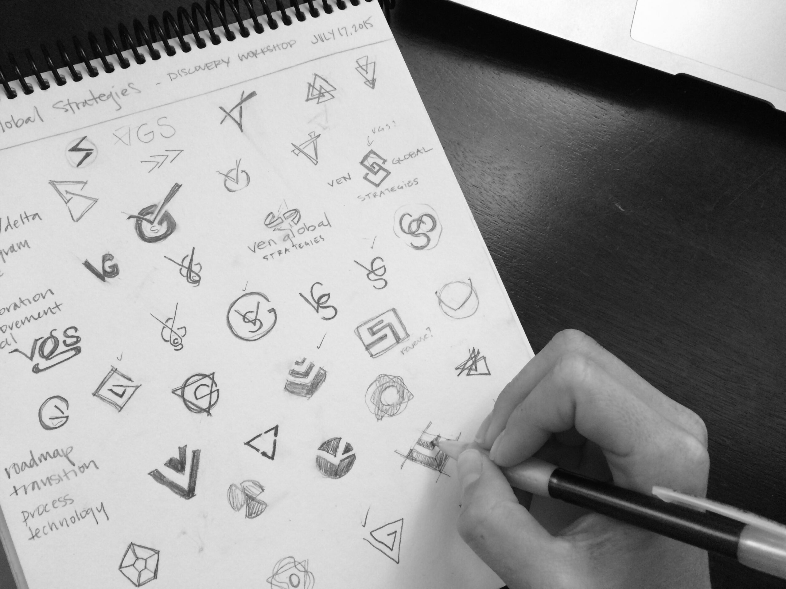
Sketching is a valuable practice in logo design. It facilitates quick iterations that allow the designer to hone in on a logo’s final design. When the time comes to fire up the design software, it’s imperative to create a black and white logo first. Why? Black and white logo design is a method of pressure-testing a logo’s strength and versatility. Will it retain interest in its most simple form? Is it still recognizable if printed in black and white, etched in wood, or remade into a rubber stamp? In this digital design age, it’s an easy step to skip, but one that produces an exponential return on invested time.

When Chermayeff & Geismar designed National Geographic’s logo in 1967, they conducted surveys to evaluate which brands the public associated with the color yellow. They had a hunch that incorporating the color of the magazine’s border into the logo might be an interesting choice, but would consumers make the connection? The overwhelming majority did indeed associate National Geographic with the color yellow. The results of the study confirmed the use of yellow in the mark for the team.
If this information makes logo design sound daunting, we have some good news: logos can evolve. They change for so many reasons–from societal values to company rebrands to technological advancement. It is so fascinating to watch the evolution of a logo.
Can't wait for the rest of the series?
Now remember–this post outlines the building blocks of logo and color, the third of four parts of the brand identity recipe! The best way to get the latest blog post notifications is to follow us on Instagram. The final installment in the series will be published four weeks from today!

Follow Us
Join Us
Subscribe For More Delightful Updates, Like This.
Fresh-squeezed ideas sent straight to your inbox.
Brand Identity Resources We Use
More Freshly-Squeezed

