Brand Identity Series, #2: Typography
This is the second installment of this series on brand identity explores the impact, definitions, and evolution of typography.
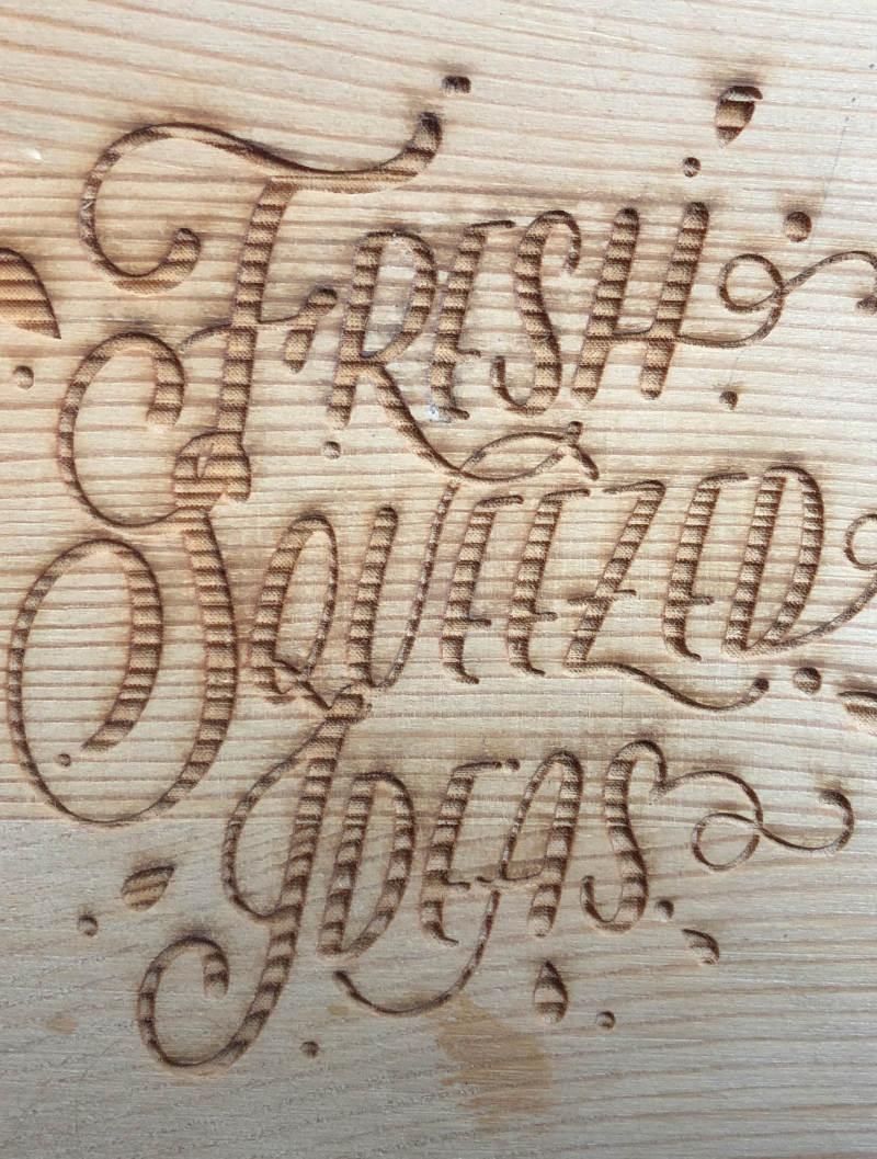

Typography is what language looks like.”
– Ellen Lupton
What is typography? Does it matter? What does it even have to do with branding?
Excellent questions, hypothetical reader.
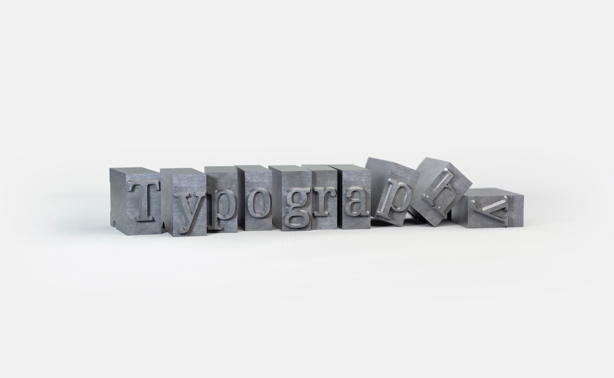
Photo by @florianklauer
The right font can help consumers identify the key characteristics behind a brand’s attitude. This can then encourage them to make positive, conscious associations with its products and services. It’s the logical next step in our brand identity process after messaging. Let’s take a look at some well-known brands and their typography choices to understand what they’re trying to communicate.
HOUSE RULES
Before we take another literary step, we have to establish some house rules:
1. Typography is the all encompassing practice of arranging type so that it is legible and engaging. Think of typography as the umbrella for anything related to type.
2. Times New Roman and Arial are not fonts. They are typefaces. Times New Roman Bold 14 pt is a font, though!
3. A serif is a typeface with small lines at the end of each stroke (like Times New Roman), whereas a sans serif is a typeface without the small lines (like Arial).
Just had to get that out of the way. Okay, onto our analysis!
Coca-COla
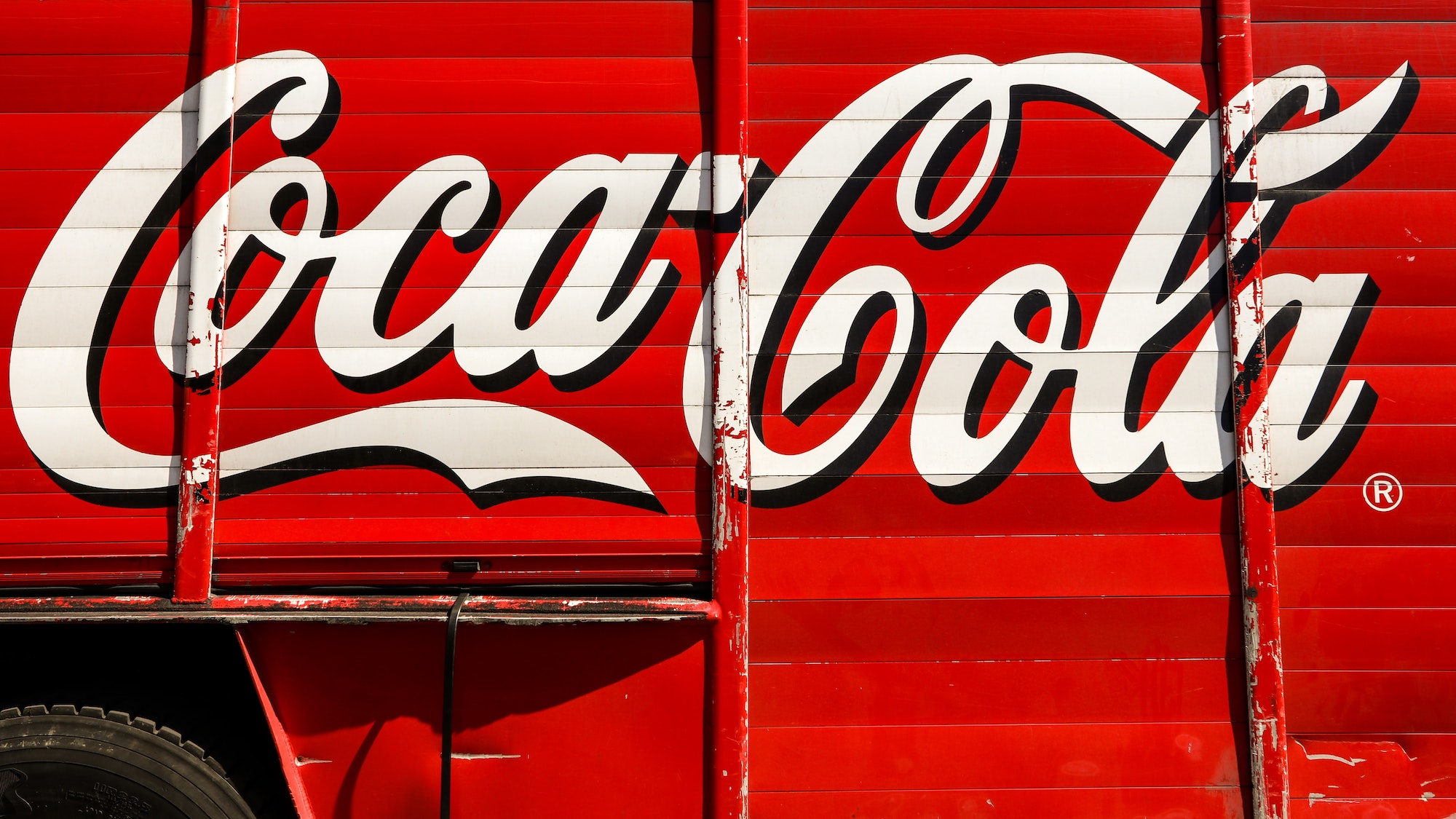
When it comes to conveying personality through type, certain details within letterforms offer particularly rich opportunities. Characters with more curvature are always easier to build a sense of personality. Take Coca-Cola, for example. Their long-standing history as a brand is exemplified by the recognizable type they designed. The curly script above, formally known as Spencerian Script, is meant to inspire nostalgia, happiness, and tradition. Mission: Accomplished, Coca-Cola.

Did you know that most sans serif fonts technically don’t have true italics in their font family? Italics is a font style used to describe the slant or slope of a typeface plus ligatures or swashes to make them look more like script, thus conveying emphasis. Since sans serifs don’t have serifs (living up to the French translation of “without serif”), they are instead described as “oblique.”
NASA

Here’s a different kind of personality for you. The contrast and modulation of the strokes, how a stroke termination is shaped, and height to width proportions determine whether a design is perceived as warm and friendly, or cold and mechanical. As a result, typography can reinforce (or undermine) a brand’s authenticity. NASA, for example, utilizes zero contrast between stroke and terminal, resulting in a very modern typeface. Can you imagine if NASA used a curved, scripted type instead? We’re not so sure that kind of type aligns with the values associated with space exploration and innovation.

Let’s talk about typography anatomy since we’ve already dropped quite a few terms. A stroke is the main vertical diagonal line in a letter. And at the end of a stroke, there is either a serif or a terminal.
In any typeface, each letter has a weight, or thickness relative to its height. Contrast refers to the ratio between the thick and thin lines of a letter. As discussed above, NASA has a low (or rather non-existent) contrast. Conversely, the typeface used for Coca-Cola has a comparatively higher contrast.
Mailchimp
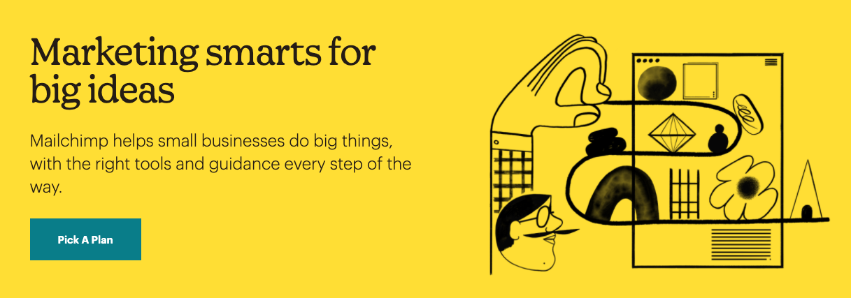
In a sea of sans serifs, Mailchimp shines with its rebel serif heading, Means Light. The email marketing company describes its headline font as “elegant,” and we couldn’t agree more. The contrast, terminals, and serifs on this type really do work to evoke their intended values: trustworthiness, optimism, and sincerity. It comes as no surprise to us that they were nominated for the 2019 Type Champions Award.

Serifs are fancy and all, but they can be hard to read. In 1816, William Caslon IV changed the game with the invention of his sans serif type. He called it…Caslon. It wasn’t widely adopted at first but it gained popularity later on because as it turns out, sans serifs are pretty easy on the eyes. Over the next couple of centuries, we’ll see a sans serif revolution with the likes of Futura, inspired by geometric shapes, and Helvetica, lovingly dubbed the “sweatpants of typefaces” by John Boardley, among countless others.
Masterclass
“Thou shalt not use an astronomical amount of fonts for your brand’s font hierarchy.”
— The Typography Gods
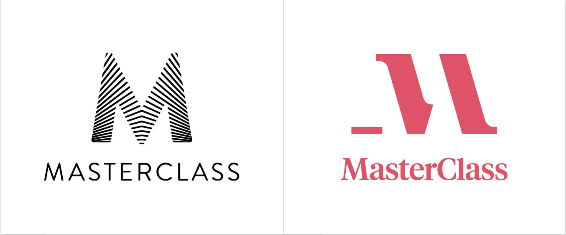
The Gods have spoken, and they have a point. It makes for a very disorienting user experience when there are too many fonts in any format. In Masterclass’s recent rebrand by Gretel, they obviously changed up the logotype. But we want to talk about the new class sub-brands. Now, each class has its own visual identity, including font, color scheme, and imagery.
But…Masterclass has more than 85 classes, and the Gods said not to have more than three fonts! While each class indeed uses a different font, they all come from the same two font families: Sohne from Klim and Ivar from Letters From Sweden. Doing so introduces some level of cohesiveness that is downright delightful. Somehow, choosing a class feels as fun as choosing an ice cream flavor. How did Gretel do that?
Typography, that’s how.

Who said we had to use sans serifs on the web anyway? Back in the ’80s and ’90s, computer screens were not refined enough to render legible serif typography. Serif text would appear blurry, resulting in a not-so-delightful user experience, and not-so-great user experiences lead to users not coming back to your site. So sans serif became the industry default. Today, we have the luxury of utilizing serifs in our font hierarchies because screen resolutions have improved markedly since the ’90s.
Chobani
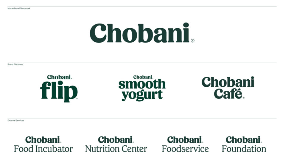
Since the yogurt company was founded in 2005, it used an angular sans serif font called Broadband to adorn its plastic cups. That is, until the big rebrand two years ago with a custom typeface as the star of the show: Chobani Serif & Chobani Sans. Berton Hasebe and Commercial Type collaborated on the logotype and font, respectively.
For the record, we are big fans of this type. It’s putting us in the mood for Greek yogurt right now! Branding doesn’t get much better than that. And the icing on the yogurt cake? They didn’t reserve the typeface for just the logo. They sprinkled that Chobani Serif goodness throughout the brand architecture as well.

You might have heard someone describe a typeface as “modern.” However, this is not an arbitrary description. Typeface styles are primarily denoted by the time period in which they were prevalent. Since we were just discussing Chobani, let’s cover the main serif styles: old style, transitional, and modern.
Old Style typefaces are denoted by thick strokes, low contrast, and angled serifs in typefaces like Centaur or Garamond. As for transitional, you’re familiar with Baskerville, right? Transitional serifs appear a bit more mechanical and contrasted compared to Old Style. Finally, modern serifs like Bodoni feature high contrast strokes and “ball” serifs, designed to look like they were written with a fancy pen.
Has the word “serif” lost all meaning? Good! That means we’ve discussed this topic at length. We hope that you enjoyed our take on typography as a component of brand identity. It’s still amazing to us that so much can be communicated just with the way a letter is written. Stay tuned for our next installment in the brand identity series two weeks from today!
Can't wait for the rest of the series?
Now remember–this post outlines the building blocks of typography, the second of four parts of the brand identity recipe! The best way to get the latest blog post notifications is to follow us on Instagram. For our next topic, we’ll dive into logos and color.
Follow Us
Join Us
Subscribe For More Delightful Updates, Like This.
Fresh-squeezed ideas sent straight to your inbox.
Brand Identity Resources We Use
More Freshly-Squeezed

