The Case for Design: Voter Turnout

As part of our ongoing series “The Case for Design,” we take a look at the branding and design principles exercised in several posters designed to encourage voter turnout for the United States’ 2020 presidential election.
Photo by Element5 Digital

Real and enduring change happens one step at a time.”
– Ruth Bader Ginsburg
Name Some Famous Pairs
PB & J. Spaghetti & Meatballs. Salt & Pepper. Design & Politics.
…Wait, what was that last one?
Photo by Dan Dennis
You heard us right. Design and politics go together, as one influences the other and vice versa.
With the voter registration deadline coming up on October 13th for most states, there’s no better time to write a piece about gettin’ out there and votin’! It’s also that time of year when we start to see a flurry of creative works encouraging voter turnout, thanks in part to civic engagement campaigns like AIGA’s Get Out The Vote, as well as platforms like Dribbble that showcase the bold talent of individual creators all over the country.
And you know how we love a good creative opportunity to promote our civic duties…
…Or at least, now you do.
What we love most about these creative works is the variety in the emotions they evoke despite the fact that they all sought to convey the same message: Get Out The Vote. From empowerment and responsibility to mindfulness and dignity, the emotions differ thanks to an expert use of branding and design tools, like tone, imagery, typography, and content. In our previous blog post on brand identity we wrote about how there are a variety of ways to convey the same message. It just depends on what feels right for your brand. And as it turns out, voter turnout posters are no different.
Photo by Element5 Digital
So in the spirit of the upcoming election, let’s analyze how a few submissions from AIGA’s Get Out The Vote 2020 campaign communicate the primary message outlined in the project brief: Get Out The Vote!
Concept #1
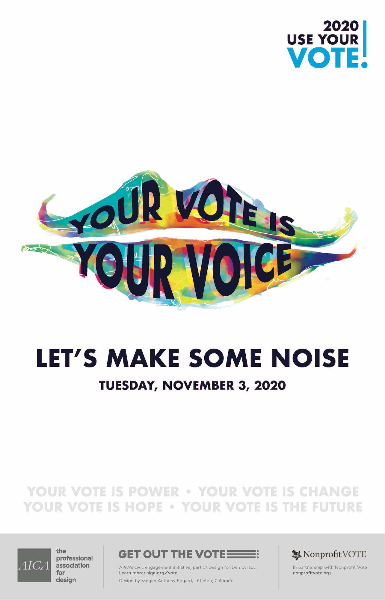
Your Vote is your Voice by Megan Bogard
AIGA’s Get Out the Vote Campaign
Pronouns
The use of “Your” in both the tagline and bullet points below instills a sense of responsibility within us to make a difference by using our voices. Moreover, the “Let’s Make Some Noise” drives the collective, togetherness messaging home…and also makes us think of a party. Sign us up for that!
Color
Many designers typically use both red and blue to communicate bipartisanship, but the colorful palette here takes the political parties out of the equation and thus enhances bipartisanship in an alternative way.
Concept #2
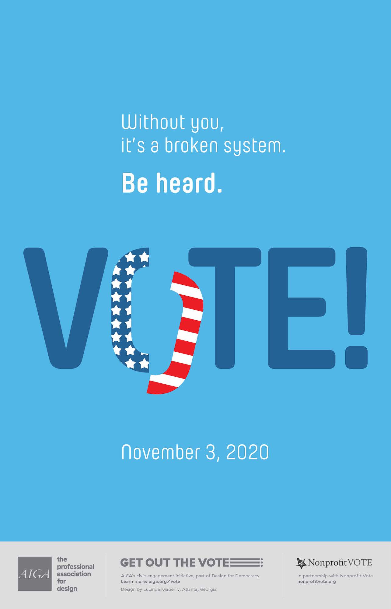
Without you, it’s a broken system. Be heard. VOTE! By Cindi Maberry
AIGA’s Get Out the Vote Campaign
Imagery
As exhibited in both the copy and the visuals, Cindy’s broken O in a patriotically designed “VOTE” hammers home the grave alternative to exercising your right to vote–a broken system that does not accurately represent the people.
Typography
We appreciate that “VOTE” is the largest text in this poster, drawing our eyes toward it initially so that at the very least, our brains register the meaning of the word.
Concept #3
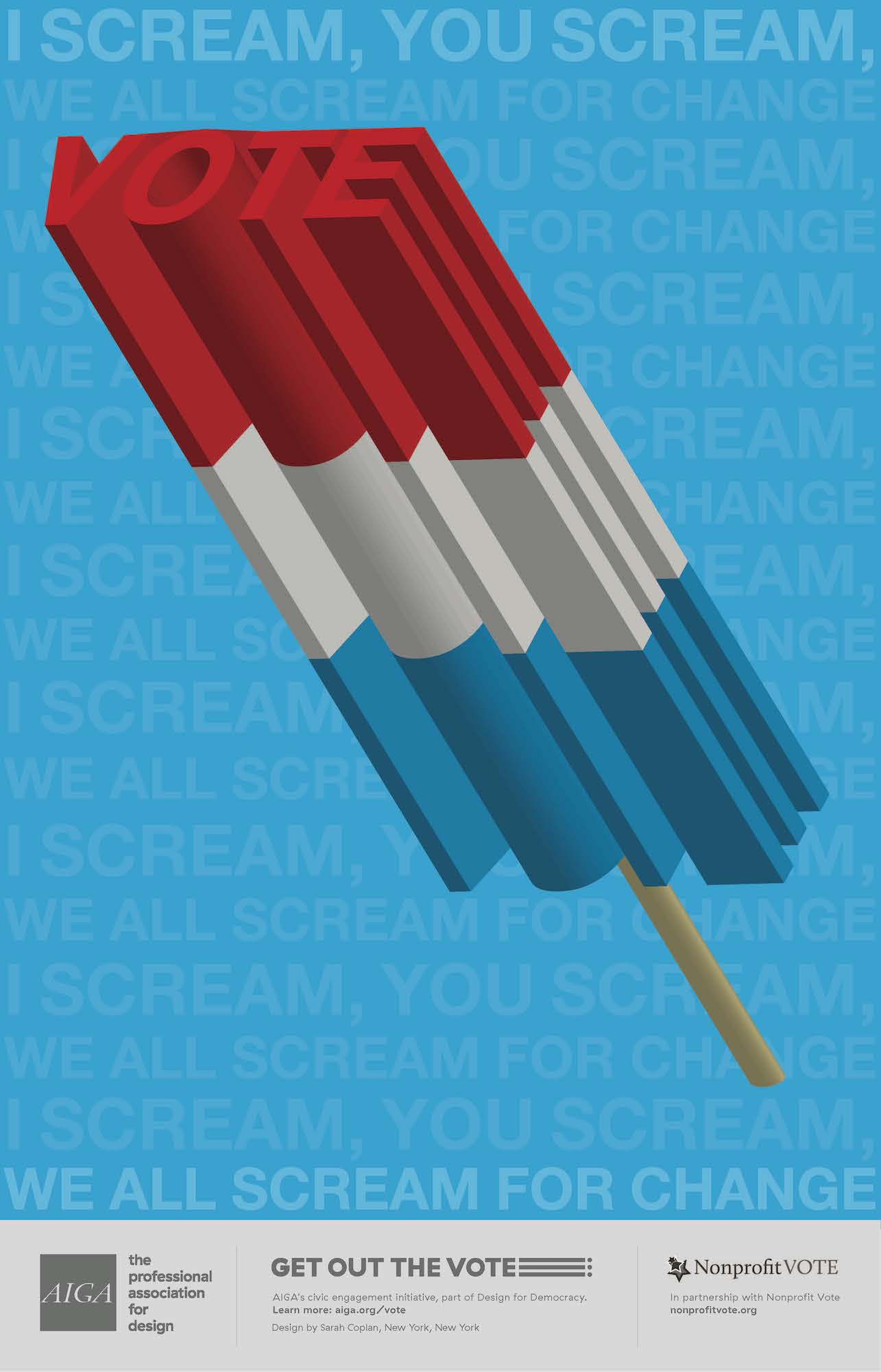
I Scream for Change by Sarah Coplan
AIGA’s Get Out the Vote Campaign
Imagery
We’re initially drawn in with the playful recognition of “VOTE” in the form of a childhood summer treat, but soon realize that this is about more than ice cream thanks to the riff on the lyrics to an old children’s song subtly overlaid on the background.
Tone
In addition to the text in the background connecting the imagery to the messaging, the words “We all scream for change” send us on a roller coaster of emotions from congenial nostalgia to acute foreboding. The sharp dichotomy between the imagery and the tone equates to, in our opinion, an effective poster.
Concept #4
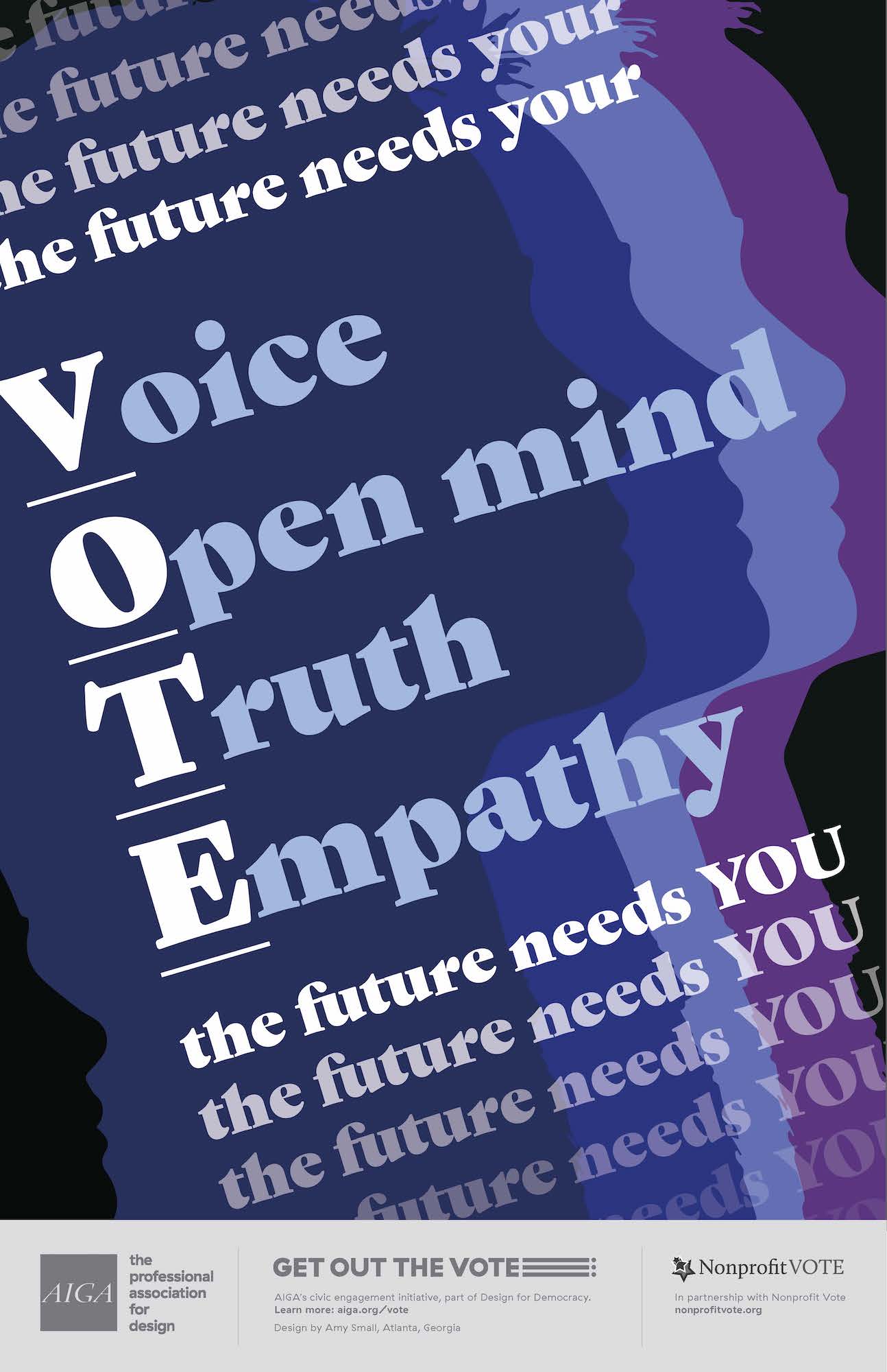
The Future Needs You by Amy Small
AIGA’s Get Out the Vote Campaign
Copy
The first thing we notice is the use of the word “VOTE” in big white letters as an acronym for the values that are represented in exercising your right to vote.
Voter Culture
That was so fun, wasn’t it? Thank you to the artists highlighted in this post, to everyone who submitted their work in the campaign, and to the campaign itself! Designing a poster is just one of the many things that we as individuals can do to drive the awareness and importance of voter turnout. But we believe that’s only half the battle. Company culture has to play its part too!
Below are just a few examples of how companies like Patagonia, GAP, and The Brand Stand are driving voter turnout from within:
- Giving employees PTO to go out and vote.
- Providing educational resources on how to vote in the form of online repositories, promotional print materials, and more.
- Celebrating election day in the form of office parties, no meetings day, etc.
- Talking about it!
Looking for Voter resources?
We’re big fans of exercising the right to vote, so we got your back. The best place to find information on how to vote in your state is at VOTE411. For more information, visit the resources listed below.
Follow Us
Join Us
Subscribe For More Delightful Updates, Like This.
Fresh-squeezed ideas sent straight to your inbox.
More Freshly-Squeezed

